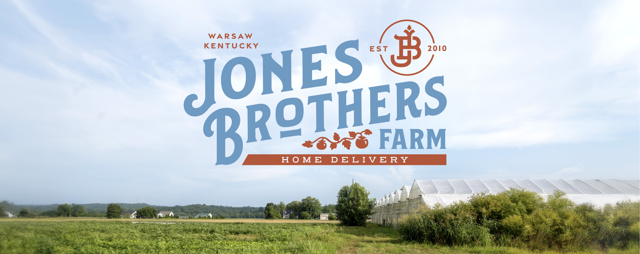
Jones Brothers Farm, a family-run farm-to-home subscription service, needed a logo that reflected both its agricultural roots and its modern commitment to quality and sustainability.

We created a vintage-inspired mark with rustic colors drawn from the farm itself; light blue from the iconic painted barns and a rich reddish-orange from their very first crop, tomatoes. The upward slant of the wordmark conveys growth and forward momentum, while the supporting elements celebrate the farm’s history and values.

Design System

Since ’10

Within the “Brothers” lettering, the number 10 is subtly integrated as a nod to the year the brothers began their farming journey, embedding their story into the brand itself.

The First Crop

A hand-illustrated tomato vine weaves through the wordmark, symbolizing their flagship crop and the foundation of their farm’s early success.

JB Monogram

Anchoring the lockup is a monogram of J and B, styled to resemble a traditional livestock brand. The B curves with a horn-like flourish, evoking the meat side of the business, while the J sprouts upward with a leaf-inspired top, representing growth and their commitment to fresh produce.

Result